
Users drop off halfway
Sign-up, checkout or booking flows have too many steps or unclear labels, so people give up before finishing.
UI/UX DESIGN
We plan and design websites, web apps and mobile apps around how real users move through them, then hand developers clear, build-ready screens.
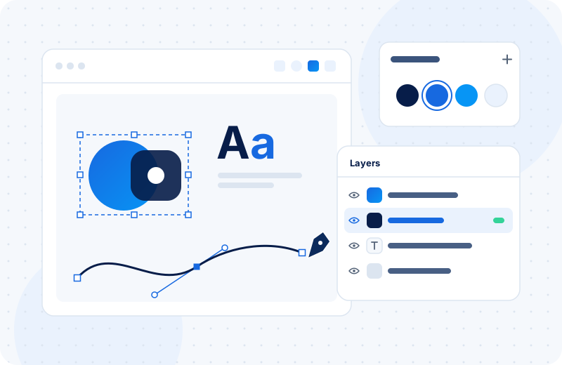 UI/UX Design
OVERVIEW
UX is about structure: what a user is trying to do, which steps they take, and where they get stuck. UI is the visual layer on top: layout, buttons, type, colour and spacing. Good products need both, and they need them decided before a developer writes the first line of code.
We start by mapping user flows and content, then move into wireframes that show the layout without visual distraction. Once the structure works, we design the final screens and build a clickable prototype you can test and share with stakeholders.
Everything is done in Figma with reusable components, so developers get consistent spacing, states and styles instead of guessing from a flat image.
COMMON PROBLEMS
Sign-up, checkout or booking flows have too many steps or unclear labels, so people give up before finishing.
Without proper screens, developers make layout decisions as they code, which leads to inconsistent pages and rework.
Features were added one at a time and now the navigation and screens don't follow any shared pattern.
The desktop version looks fine, but on a phone buttons are cramped and key content is buried.
WHAT'S INCLUDED
Diagrams showing how each type of user moves from entry point to goal, including edge cases.
Low-detail layouts for key screens so structure and content can be agreed quickly.
Final screen designs for desktop, tablet and mobile breakpoints as agreed in scope.
A linked Figma prototype you can click through, test with users and share with your team.
Reusable buttons, forms, cards and navigation elements with their hover, error and disabled states.
Organised Figma file with naming, spacing, colour and type styles ready for inspection.
HOW IT WORKS
We begin with a working session to understand your users, business goals and any technical limits. If there's an existing product, we walk through it and note the friction points. From there we agree which screens and flows are in scope.
Wireframes come first and get reviewed before any visual design starts, which saves a lot of back and forth later. Final designs and the prototype are shared in Figma, where you can leave comments directly on the screens. At handoff, developers get view or edit access to the file, plus exported assets like icons and images.
Problems are caught in wireframes and prototypes, where they're cheap to fix, rather than in code.
Users find what they need with less effort, which supports sign-ups, sales and repeat use.
A component library means new features follow the same patterns as the old ones.
A clickable prototype makes it simple to show investors, clients or staff what you're building.
OUR PROCESS
We review your goals, users, competitors and any existing product or analytics you can share.
We map pages, navigation and user journeys so everyone agrees on structure.
We sketch key screens in greyscale and refine them based on your feedback.
We apply your brand, design final screens and link them into a working prototype.
We prepare the file for developers and stay available to answer questions during the build.
Chosen to fit the project. We'll use your existing tools where they do the job.
RELATED
Building a subscription product means getting accounts, billing, permissions and the core feature right at the same time. We help founders…
Learn moreA good app does a few things really well. We plan, design and build mobile apps for iOS and Android, along with the backend, admin panel an…
Learn moreWe find where visitors hesitate or drop off on your website, fix what's getting in their way and test changes so you know what actually hel…
Learn moreFAQS
We can. Our development team can build from the same Figma files, or we can hand everything over to your own developers.
Yes. Once the project is complete and paid, we transfer the file to your account or share it with full edit access.
We can run simple usability tests with the prototype, either with your customers or a small group you choose. The depth of testing depends on scope and budget.
It depends on the number of screens and how complex the flows are. A small website is far quicker than a multi-role SaaS product. We'll estimate after discovery.
Yes. We often work on a single flow, like onboarding or checkout, while keeping the rest of the product as it is.
GET STARTED
Share what you're building and who it's for. We'll suggest which screens and flows to design first.